COMPETITION BRIEF
PENGUIN CLASSICS
OUIL503
I have decided to work on the Penguin Classics covers and have done research into the books, their authors, and the covers that have been used in the past as part of Penguin Classics.
I selected a few covers, not exclusive to the Penguin company, that I think have a strong aesthetic and that I would like to take influence from


I like the subject matter of the first cover. It was one of the first ideas I had about how to approach the cover. I really enjoy the imagery of Scout checking the tree for any messages or treats, it was a really touching aspect of the novel as well.
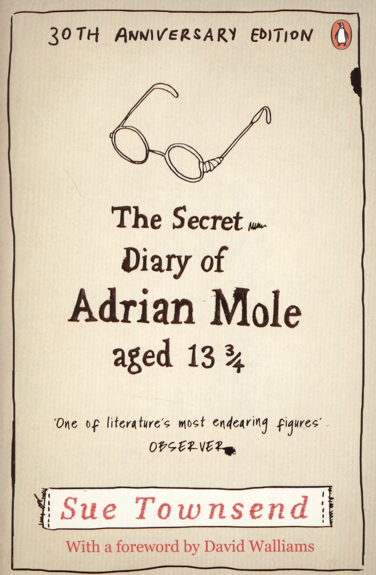
I enjoy the minimalistic aspect of the second cover. It is driven by its font type, and relies very little on the illustrative aspect. The fact that it has an illustration that is so small makes it all the more poignant.
The last cover is very interesting because of its strong marriage of graphic and illustrative styles. I really like that they used a fence as a divide between the subject and the viewer and it instantly gives you the feel of a divide between the viewer/reader and the image. You definitely get the feeling of the fence being more prison bars than a fence symbolically. I personally think the birds detract from the image, almost like being an afterthought. Compositionally it works, but the illustration style I believe doesn't really go.
I have read this book and think that it definitely is a timeless novel, and it is just as relevant and real today as it was at the time of its publication.


In Cold Blood is a very serious novel, and its the first of its kind where the novelist attempted to get a true sense of the murderer by actually meeting the perpetrator. I find it interesting that Harper Lee and Truman Capote were friends in real life.
The first image is one of the covers that most well known, and for a good reason. It is visually striking and creative, above all its painfully relevant to the subject matter. It is very minimalist which is something that i think Penguin Publishing is keen on, seeing that all of these images have the same sort of aesthetic.
The second is very strong as well and I really like the use of the gun as a form of horizon. It could be considered as quite symbolic in many ways. I equally think the branch with the nooses is very strong, and together they create an extremely powerful composition and it frames the house very well. It is imposing and can get a sense of the story from just studying the elements of this image, down to the proportion of the house, you get that these two other elements (gun and noose) are the driving force of the story. In a way it is a good representation of how these crimes are represented in the media, where the violence of the crime and the perpetrators take center stage, whereas the victims (the people who should be remembered and honoured) are a small element of the story.
The last image I put in because I enjoy the use of colours and the simple yet effective nature of the image.
I have looked and looked but I haven't found any images that I really like for this book. I haven't read it myself and I think I definitely will to do this book and cover some justice. Also to get a better feel of what would be proper material for cover subject matter.
I am really excited about this project and look forward to researching and developing ideas from what I have seen has already been published and incorporating my own thoughts and personal responses to these covers.
No comments:
Post a Comment