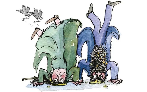
Tuesday, 31 January 2017

Collaborative Project

Roald Dhal

I really want t do Roald Dhal illustrations for the YCN brief because I love his stories. I grew up watching Matilda and The Witches and James and The Giant Peach. I didn't get the chance to read his books because growing up in Nicaragua in the 90s we didn't have all the sources available now. It wasn't until I came to live in the UK that my husband showed me his complete collection of short stories that his mom used to read him as a child. It was then that I learned of Quentin Blake and his quintessential illustration look. I also have always been attracted to being a book illustrator and childrens' books in particular.

Other childrens' stories that I enjoy are the Stinky Cheese Man and Other Fairly Stupid Tales and El Taller de las Mariposas


Roald Dhal's best book in my opinion are Fantastic Mr. Fox and The Twits and Esio Trot.


Penguin: The Judges


Here are some details I could find on the judges . 


Vimeo Video
Newspaper Article

Newspaper Article


Character Designs


All the characters are dead-eventually. The story becomes clear after the first few chapters, but for this chapter I'm doing only the first one, so it may not make sense why I'm drawing dead people at the moment. But thats why. They are all brought together eventually as well,  as the story progresses. So here I did a drawing with all four of them. Im not too happy with how Death looks like she's drawn in a different style, but seeing as she a different type of entity then maybe it accounts for the different style? Im going to have to work on her design in the future possibly.


Monday, 30 January 2017

Penguin 


Lettering


After doing my photoshop test I decided that I dont really like any of the fonts that I tried out and would like to attempt making my own lettering out of brush and ink, hand drawn. Below are a couple of examples of what I tried out. I practiced on multiple pages just the individual letters that i was going to use. im really happy with how these came out. They have a rough quality to them. A bit raw. Im not very good at this kind of thing, but I like that in a way, for this book, the fact that they arent perfect complements the title.


Saturday, 28 January 2017

Penguin


Another cover idea I have been playing around with is the a further abstraction on the concept of doors, it has a nice effect, simple but I am not convinced its exactly what the judges are looking for.


Since i want to keep this story quite true to the real life story i have been trying out covers with the clutter family. 


This is an image that has been used on the book cover before. I wiped out their faces, in this sense they loose their individuality, their is a sense of unrest in this because in this sense they could be anyone, and that means anyone close to the viewer. In taking their appearance the brain tries to fill in the gap and in some cases can form a resemblance to someone close. i am not quite sure I like this idea, i feel like its somewhat disrespectful to the family. Its sad that in cases like these the victims are often forgotten but what remains in everybody's mind is what was done to them, and who did it. 


Penguin


I have started developing trial covers on photoshop. They are not exactly what Im after but I am happy to experiment and try a number of designs 


The 'doorway shot' has been used in film for decades as a symbolic image. Particularly in John Ford's 'The Searchers' 


The idea of 'the doorway' is explained quite well in this quote

'Are you going in or are you staying out? In the world of The Searchers you must choose. You can’t have both. In this movie, everyone is on the threshold of that choice. And for some, it isn’t a choice at all, it’s just the way things work. Everything you want, everything you search for, is “out there”, or, on the flipside, everything you want is “in there”. There is a giant gap between in and out. Characters are seen standing a bit away from the house, with people clustered in the doorway, and it seems like anything, anything can happen in that gap. There is no white-picket-fence safety of a little front yard. Slaughter can happen in that 20 foot gap, swift and terrible. So you must choose. As the terrifying Judge shows in Cormac McCarthy’s Blood Meridian (my post about the Judge here), there are things that happen in life, choices you make, that forever banish you from the cozy world of the indoor, civilization itself. There is a point of no turning back. Looking through doorways, into something going on through yet another doorway, is an image that repeats itself throughout the film. Whatever happens through a door, whatever is glimpsed, is the truth of the matter, usually unspoken and private. The two shots that bookend the film, famous in their own right, and two of my favorite in the history of American cinema.'


Monday, 23 January 2017


Image result for perry smith and hitchcock

Penguin


After some research I can safely say that that quote is from the 2005 movie. Which is unfortunate because I was really into the cover idea that I had come up with. I do really want to incorporate the fact that Capote had some relationship with these two killers Perry Smith and Richard Hitchcock, and he was one of the first authors to ever attempt meeting
with real life culprits in a crime for the sake of a book. 


Capote also wrote Breakfast at Tiffany's which I find really interesting. It is such a strange off beat movie. Which I think really reflects him in a way. Harper Lee, author of To Kill a Mockingbird was close friends with him and called him a "Pocket Merlin" because he was so inventive. 


In Cold Blood started out as an article for the New Yorker, and he went with his friend Harper Lee to visit Kansas. They interviewed family of the deceased, neighbours and the police who were investigating the murder. The murderers were brought back to trial while Lee and Capote were still in Kansas and they interviewed them. Once they left, Capote remained in contact with the killers trying to get them to open up about the murders. 

The two killers were found guilty and sentenced to death and Capote went to their execution. 
Capote was greatly affected by this whole experience and took to heavy drinking and tranquilizers.

I like the facts behind the book more than the book itself if im honest. So I would like to have my cover reflect that. Im going to source real images from the victims, killers and incidents that surrounded this case as a base for my development


Saturday, 21 January 2017

Penguin: The Brief


This is the brief taken from the website

We are looking for a cover design which breaks boundaries in the same way that the book did. It should be bold, maybe even shocking, yet remain true to the book, reflecting both its literary merit and its chilling content.
Your cover design needs to include all the cover copy supplied and be designed to the specified design template – B format, 198mm high x 129mm wide, spine width 20mm, incorporating all the PENGUIN branding and all additional elements such as the bar code.
What the judges are looking for
We are looking for a striking cover design that is well executed, has an imaginative concept and clearly places the book for its market. While all elements of the jacket need to work together as a cohesive whole, remember that the front cover must be effective on its own and be eye-catching within a crowded bookshop setting. It also needs to be able to work onscreen for digital retailers such as Amazon.
The winning design will need to:
  • have an imaginative concept and original interpretation of the brief
  • be competently executed with strong use of typography
  • appeal to a contemporary readership
  • show a good understanding of the marketplace
  • have a point of difference from the many other book covers it is competing against
Copyright must be cleared for all images used in your cover design and you must include a credit line on the back cover of your design for any third party images used. For example: ‘Cover photograph by Joe Bloggs’.
What stands out to me is the fact that they want something impactful, eye catching, original.

They want something that has strong typography

Stand out from the other submissions and past covers 
Below are a few that stand out to me 

Image result for in cold blood penguin cover


Friday, 20 January 2017

Penguin


Studying the crime scene, 
below are a couple of pictures of the Clutter house, 
the place where the crimes took place. 
I was thinking I could incorporate elements 
of the house in a cover design. 


Penguin


My idea for the In Cold Blood Cover is based on a quote that Truman Capote is rumored to have said.  I have done my research and looked around on the internet and I'm fairly certain he said the following about his interviews with one of the killers, Perry Smith

"It's as if Perry and I grew up in the same house, and one day he stood up and went out the back door while I went out the front"

Below is the initial thumbnail sketch idea


I haven't read the book before but am excited to get to find the time. 

Thursday, 19 January 2017

Comic Themes and Dialogue


I want the comic to have adult language. I want my characters to be witty and quick thinkers. I would like to emanate dialogue similar to Quentin Tarantino films and The Sopranos. When I am sitting about and I get an idea for a snippet of conversation i will just write it in whatever notebook is nearest to me, which makes it hard to keep track if i'm honest. But I do my best to keep it organised. Below are a few examples. They aren't necessarily going to be included, and some are downright bad but I am trying to develop skills to write scripts. I want my characters to be very real and I want them to be likeable, even if they aren't good people.

"I'm bored, I had nothing better to do. And I figure if I'm going to hell for this shit, I figure hell ain't going to be a lot different from here anyway"
Rick Holt, when asked why he does the things he does


Tuesday, 17 January 2017

End of Module Student Evaluation
BA (Hons) Illustration
Module Code: OUIL504 Illustration 1: Production & Presentation
Name: Kayleigh Wilson
Student ID: kw265100
Please identify where the evidence for each of the learning outcomes is within your submission and how well you feel you have met the learning outcomes. Please also grade yourself in relation to the learning outcomes using terms:
> poor, satisfactory, good, very good, excellent (Note- This is so that the team have an understanding of how well you feel you have done. It is not an indication of the actual grade you may receive.)
Learning Outcome
Evidenced where?
Blog, Visual Journal, Roughs, Final Illustrations, Stings, storyboards, development sheets etc.  (No more than 75 words)
Your grade
Using words:
> poor, satisfactory, good, very good, excellent
5A5:  Demonstrate an informed understanding of issues relating to image, media, format and context through the delivery of solutions to identified visual problems.
(Knowledge & Understanding -  Critical Awareness)
Addressed brief as a figurative drawer and analised ways I could use mediums to benefit style and concept, and reflect core ideas and responses to my author.

SKETCHBOOK
Good
5A6: Understand the potential and limitations of a range of processes, technologies and techniques involved in the development and production of work for print and screen based delivery.
(Knowledge & Understanding -  Research)
Through concept development and testing media.
Research, inductions, tutor guidance and online resources to better understand media and my authors and my place within it.

SKETCHBOOK, BLOG, PRINTS


Good
5B4: Analyse and critically evaluate primary/secondary source material to inform the development and contextualisation of ideas, concepts and products through individual responses to set briefs.
(Cognitive Skills - Problem Analysis, Problem Solving)
Researched Carl Sagan books and articles.
Researched related themes to work. E.g. human evolution, species origins, geological timescales of fauna.
Looked at artists who work in monoprint, linocut and screenprint.
Designed drawings to work well in given medias.

SKETCHBOOK, BLOG, PRINTS
Good
5C4: Select, manipulate and apply appropriate media, processes and technologies in the development, production and presentation of ideas, concepts and products.
(Practical Skills -  Practical and Conceptual Development)
Learned necessary computer programs to prepare and realise moving pictures.
Storyboarded concepts and developed visual compositions and narrative to compliment print designs and ideas.

BLOG, STING, PRINTS


Good
5C5: Identify, evaluate and apply practical/technical processes, materials and media in order to produce technically competent and conceptually appropriate outcomes.
(Practical Skills - Visual Quality and Technical Competence)
Worked with screenprint and developed work through trial and error while learning the process.
Developed Photoshop and After Effects skills and put that knowledge towards animation
Experimented with all three media in brief, problem solved and decided on strongest concept/technical based idea.
Worked with drawing tools that complimented screenprint process and allowed figurative designs

BLOG, SKETCHBOOK, PRINTS, STINGS


Good
5D4: Demonstrate the ability to communicate the development and resolution of ideas through appropriate visual and written presentation of work.
(Key Transferable Skills - Presentation and Evaluation)
My visual ideas are all presented in the following:
Final Screen print series, animation, blog, Sketchbook, experimentation in lino and monoprint. Concept development throughout all areas of media evidenced in sketchbook and responses to research in blog
Good
Summative Evaluation (See Evaluation Guidance on next page for more information)
You are required to write a 750 word Summative Evaluation of this module.
Please type up your Summative Evaluation in the box below. Make a PDF of the document, print out a copy to submit with your portfolio of work and post the PDF as your final post on your OUIL504 blog.

This Module has been an exciting and challenging exploration into developing concepts, both technical and conceptual, artist research and an introduction into new media, procedures and software.

My author was Carl Sagan, someone who had an outlook on life that I respect and admire. In my work I strove to reflect ideas and concepts that he taught about, and furthermore, my personal response to them. I stayed away from the space exploration element of his work, but instead geared it more towards his teachings of human exploration, development and ideals. Societal struggles and moral compasses in everyone of us were something that in my opinion led him to do the work that he did. Which is why he was not only a scientist, but a teacher as well.

For our first project we developed a Zine. I struggled with this as initially I didn’t even know what a zine was. I based the concept around the origin of words, specifically words to do with outer space. I wanted to illustrate the beauty and origin of these words we use today that may seem commonplace. The long history they carry with them rooted in mythology and first widely recognised western documented exploration of the cosmos. Carl Sagan would often mention the origin of a word in his documentaries and writings and I remember how much my appreciation for that word grew instantly. Due to the tight schedule of this short brief I ended up having a few regrets. I didn’t get to print my zine, instead submitted the one I had done by hand, and I would have liked to make the message of the Zine a bit less vague. Technically as well, I feel that I didn’t do the concept justice with the quality of my drawings.

The Editorial Brief was a very exciting project. I enjoyed the short tasks set, and the emphasis there was on developing multiple designs, thumbnails and sketches to study the different elements that go into making an editorial piece, and how multiple illustrations could work in harmony within one article while highlighting different topics and elements.

I enjoyed discovering new artists through this brief, and learning about the conceptual and symbolic nature of many editorial pieces. This type of art has a great element in creating concept while delivering or highlighting a message; all the while working alongside a written piece. At times even using the text itself to illustrate the idea. I kept my ideas very simple and used word association to illustrate concept along with personal response to his work. I picked an article Sagan wrote called Why We Need To Understand Science, I took that sense of urgency and danger from his  article and translated into the mood of the drawings. I worked in pencil, and took those into photoshop, at the end I decided to do some hand drawing illustrations using traditional media such as pen and ink. I was really pleased with the outcomes of all of my pieces for this brief, and there is very little I would change from my approach, delivery and outcome. I also discovered a love for a different type of illustration, one I hadn’t been able to take the time to research, explore and analyse before then.

Printed Pictures has been the brief where I have explored most media, concepts, contextual development, exploration and learned an array of different skills, both traditional and digital. Just by the sheer number of inductions and immediate application of these new skills to our projects. It has been a sometimes daunting, but extremely rewarding learning experience, that most times was so entertaining, it didn’t feel like learning. I experienced ups and downs of having to drop concepts and start anew, and application failures where ideas didn’t work on the medium I had planned. I problem solved in various aspects of my illustration and process, and experimented with ways in which I could retain my figurative style while meeting the criteria and developing my work. I learned about human evolution and human history through my research. I overcame my fear of the print room and digital programs and delivered final polished work.

Every step of the way, teacher and peer feedback was massively beneficial in getting a new perspective on the work I was doing and how my ideas translated through illustrations, as well as how they could be technically better. This has been a long and deeply rewarding Module and if I could do anything over, it would be using the resources our school provides more readily, sooner.

OUIL504 Printed Pictures Outcome


>


Positives
1. Finished Set of prints
2. Positive use of screenprint
3. Adapted to problems that I came accross

Negatives
1. Would have preferred a cleaner set of final prints
1. Would have liked a little bit of grey tones somewhere

Monday, 16 January 2017


RESPONSIVE
COMIC DEVELOPMENT
SCULPTURES AS REFERENCE


I was having a hard time drawing my main character Anna Keres, so what I do in these cases is do a sculpture of my characters to get a visual of what they would look like from different angles and how the light and shadows would rest on their faces. Her face is really simple, and I havent done any sculptures in a while so I struggled a bit but I think I got the gist of her pretty well. I haven't finished it, her jaw is a bit too wide, and she has no hair on the back of her head XD 

Below are some images of the sculpture I did


OUIL 504

Sting Outcomes


Sting Final from Kayleigh Wilson on Vimeo.


Positives
1. Good use of print design to develop animation
2. Simple and effective movements
3. Good use of humour and sound effects
4. Lots of information for 30 second animation


Negatives
1. Would have liked to do more exaggerated actions 
2. Would have liked to find or make a good background track to add to the animation

OUIL504


Idea Pictures Outcomes


Editorial Illustrations

Positives

1. Well-Researched 
2. Consistent with chosen article
3. Good use of symbology, word association and imagery
4. Produced good quality artwork
5. Listened to advice from peers and tutors


Negatives

1. Final drawings could have been made larger
2. Could have added finishing touches on Photoshop
3. Not great quality photos uploaded


Carl Sagan Sting Final from Kayleigh Wilson on Vimeo.


After Effects was a very fun program to use. I tried different ways of working through my images for this animation.

Initially I thought I should pan down the image, because they are A3 Portraits and I wanted to include all the artwork, but decided that cutting up the image and framing it would be more effective overall.

The original idea was to pan down and zoom into each character to show off the bits of animation. But I noticed that it was still getting lost within all the constant movement. I noticed as well that this method would take up way too much time and I had a lot to show because its such a busy image.

Unfortunately I no longer have that version of the video that I animated, but I did have it on display on Fridays' crit.

I finally opted on the frame to frame method and I feel this is the best way to go about it. I show all three illustrations in the end, followed by my authors' name.

My husband and I did the voices, and the animal/jungle noises were sourced from the web, using Royalty Free websites.

OUIL504 Sketchbook Highlights


Sunday, 15 January 2017

Style Experimentation


COMIC

These are all slightly different designs of Anna's face, just trying to get the hang of drawing her.


Thursday, 12 January 2017

OUIL505

REPEAT PATTERN


Photoshop
File-
custom-
centimeter

Apply rulers to square

Adjust to the appropriate canvas size


Make sure guides are not locked


The template to begin the pattern making should look like this


Import necessary files and arrange them within the square as desired


Select fill in the PS dropdown menu


Once you have created the desired pattern the image should be turned in a pattern file by selecting define pattern on the dropdown menu. To add colour in the future to this design you should delete the background colour.


To continue, create a new file page to the dimensions you require for the pattern. Then insert pattern into blank document.


Select desired background colour and select the hue that you would prefer for the background


To change the hue of the skull design go to the  tool bar above layers to this icon  this will allow you to change the brightness hue and saturation of the linework


Save as a PSD 
Make sure resolution is not lower than 300

Returning to your original document, in your layers tab, to organise layers and facilitate making new patterns, you can group your entire set of layers into one folder


For repeat patterns where the edges need to be joined over a larger sequence, you begin in the same way within the lines