Tuesday, 28 February 2017

Collaborative 


We've gotten the character and scene designs from Mario and Rey and we're pretty happy with the outcomes. Mario and Rey done a really really good job of putting it together. Its now up to me to do the line work for the group.


Theres really god attention to character traits in the designs Mario did and they were right on tme so that we are running on schedule. He let us know everytime he finished one on our FB  chat so we were always up to date. Everyone has been really good about coming to meetings too and Rey as well seeing that he is from animation and has another collaboration going on at the same time. Everyones been really vocal with what they do or dont like so we've always been on the same page, making sure everyone is heard out and happy with the direction we are going in. I'm really happy with my group


Action Plan UPDATE


After a meeting with one of my tutors I have decided to trim down the amount of page on the Personal Comic Brief. I feel that at this stage I would have to sacrifice the amount of time I cant put in for 24 pages. So I will produce instead 4 completed pages, hand drawn and painted with a front cover.
5 images total.

In addition to that I will develop a 3D model of main character to help the drawing process. To draw my character in different lighting, situations and from different angles.

As well as have finished character illustrations as development.


Murder Pages Development


Murder page ideas.    ISSUU


I have been developing the pages of Anna's murder, which is at the end of the comic.
I want to ensure they have a good flow and show the speed, movement and drama of the action.
I am unsure at this point if I will be able to complete the 24 pages. I have spoken to Ben, and he highly recommends I cut down the content to something more manageable.
Below are some examples of the final scene. They are very rough thumbnails, but I wanted to do them quickly so as to get a general idea of how the entire comic could flow. I am currently working on the script as well.


Saturday, 25 February 2017

Mowgli 


Mowgli is the main character in the Jungle Book. Raised by wolves, he first ends up in the forest at the age of 2 and later on when he appears in the book he is aged 14. The name "Mowgli" is a fictional name that means frog, because he is naked and lanky like one, and it only means frog in the language of the jungle, not in human languages.

I have started illustrating Mowgli because it will help me get a good visual for the book and determine the style I want to illustrate in. I have also been looking into Indian traditions and seeing if he would have any piercings or markings on him. He stumbles into the jungle and the wolf den at the age of two, and he is naked. From my reearch I can gather that he would probably have a piercing on his right ear, a common thing for boys to have their ears pierced in infancy. A tradition called Karna Vedha 


I have gathered a couple of images of young boys to use as reference for Mowgli's appearance along with my initial drawings


Image result for indian boyRelated image


Image result for indian boy


Friday, 24 February 2017

Collaborative


Mario and Rey have coordinated meeting at the time being to develop the designs and once they have come up with drafts we will all have a look and see if we are happy with the designs. 

I am reading up more on Roald Dhal and Quentin Blake and they were very interesting people. As well, it is really cool reading the books again and then seeing that even though the characters and illustrations over all are so simple, they really do keep true to the story and details given for each scene he illustrates. It's something I really want to take note of because I like my work but there is definitely something really special about working so quickly and loosely and capturing so much life and character into the drawings 

Link to a brief Roald Dhal's Bio

Link to a brief Quentin Blake Bio


Thursday, 23 February 2017

Collaborative


The scenes we have decided on as a group after doing research and reading up on the books we chose are:

BFG, blowing dreams into childs ear from a window.


The Witches, Grand High Witch scorching fellow witch at assembly.


James and the Giant Peach landing on the Empire State Building. 


Comic Title


I had a hard time deciding on the title of my comic. I have gone back and forth with some names unsure of which was best. 

I had thought of The Bloodhound, which I had included as the title on the flyer I made at the comic fair. But that didn't really resonate with the elements that are going to be included in the story. I had thought the bloodhound simply because in later chapters the  characters seek vengeance from the people who wronged them in life. 

I had thought of the title The Revenant before the freaking movie came out but then that happened.  thought it was great too because of the meaning 'A person who has returned, especially supposedly from the dead.' and with a vengeance normally.*spoilers* And that's what happens. 

And then I settled on Hellhound. It's simple and its one word which I think is nicer. I came to pick it after I decided all the characters names, and since I have used references to mythology in the characters' names, I thought why not on the title. 

Hellhounds and are present in mythologies worldwide, which I thought was nice because there are characters from different backgrounds. Also, there are hellhounds in Nicaraguan mythology, where I grew up we called them Cadejos. And they can be good or bad, depending on your actions. Also, there is the myth that if you stare at a hellhound three times in the eye you will die. This doesn't make much sense at the moment, and especially not in the first chapter but these touches play a big part in the overall premise.

Tuesday, 21 February 2017

Collaborative


After meeting again today we decided that we would break down tasks as follows.
We'll have one character designer:Mario
One scene designer:Rey 
One inker: Me
And the final person will do the colour and screenprint:Kieran 

We all really liked Mario's character designs so we decided that he was best for the job. And he was happy about that because he was not a fan of doing ink or colour.

Rey is from animation and because he does character designs, but also understands characters within their environments well we all thought he would be great for designing the scenes with the characters. 


People were happy with my linework on my sketches, especially with the ink and brush so I volunteered to do the inking .

And Kieran loves screenprinting and have been working with colour loads recently and he was very happy to do the colouring and screenprinting. 


We feel screenprinting will achieve the best and most finished outcome and will look nice and professional. 

Penguin: Final Touches


So I have been trying these different cover styles out and I made a quick template for myself in photoshop for when I am laying pictures and text down, so I don't go out of bounds for the printing requirements. I hopefully have done it right. Fingers crossed. 


And now I have been working on my design for a while now and I am quite happy with how its coming out. Below are some examples of the final outcome. 


Monday, 20 February 2017

Collaborative


We have decided on a style!

We all enjoyed Mario's character design drawings very much and we think they have the qualities we are looking for collectively. 


As for the medium we will be working in we have decided that the idea of doing a set of colour illustrations instead of the black and white would work best. 


We would like to do either watercolour or screenprint. And the guys liked the drawings that I brought in of my three scenes done in brush, so we think that may be a contender as a final look. 

We are going to start thinking of how we can break up responsibilities in the most efficient way. 

Rudyard Kipling -The Jungle Book. 

A Publication


Rudyard Kipling was born in the state f Bombay, India in 1865 while his English father was stationed for work there, he left when he was 5 years old. He grew up in England and published The Jungle Book in 1894 after the death of his son in WWI. The death of his son changed him forever and he struggled with it for the rest of his life. He was a well traveled man, going to India, South America and the US.

His novel, among others is still popular today, and his legacy lives on. He also had fantastic eyebrow game. 

I am really excited about reading the Jungle Book. I watched the movie as a child and it has always been one of my favourties. Im sure the book is going to be better, they always are. I hope to learn as much as I can about this book and produce accurate pictures to the story. I am really interested in book publishing and the scenery in this book I'm sure will be beautiful and colourful so I am excited to give it a go and try and design my first publication.

Saturday, 18 February 2017

Collaborative


The characters we all have decided on are as follows!
The BFG is our Magical Creature

The Grand Witch is our Villain

James and the Giant Peach is our Child


We have been debating what the best scenes are but we think its bes is we give the books a it of a read through before. We want to hold true to the stories and draw the characters true to the book. If James is wearing a blue shirt n whatever scene we pick, we want to make sure we get that right.


As far as I understand it the BFG has a long hooked nose, huge ears, wrinkly face, black coat, trumpet of what ever and a briefcase. 

The Grand Witch wears a black dress, she's really petite, elbow length gloves.

And James Im not so sure. 


We will brush up on these characters and meet again to break down tasks 

Friday, 17 February 2017

Proposal Form 

Project Rationale


What do you intend to do and why

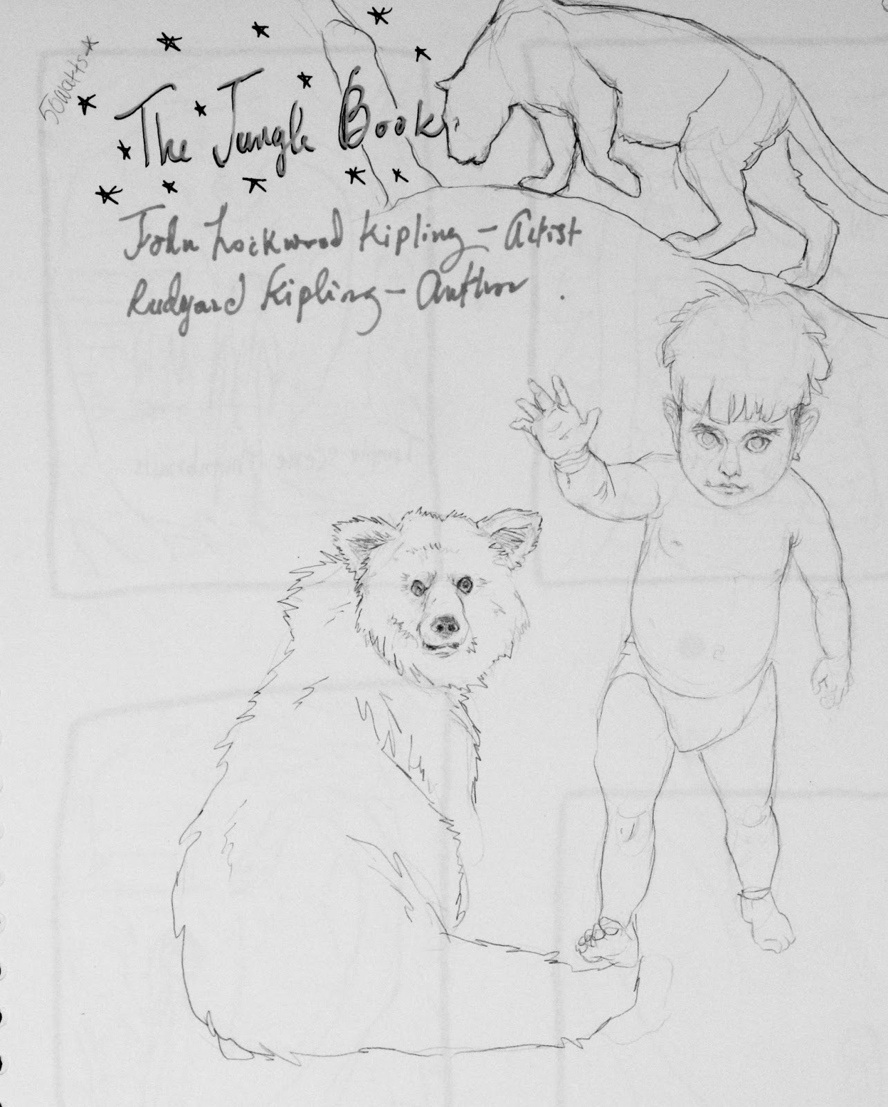
Make a minimum f 6 illustrations for The Jungle Book, which is in the public domain. It is a book that I am not too familiar with. I watched the Disney move as a child and am interested t see how the novel and movie differ. I am interested in the type f imagery I can create given such a setting and characters. I would like to make accurate illustrations for the book and test visual visual narrative within the image using symbology and composition to delineate the significance of that moment and time in the story that i am illustrating. 

Themes/Subjects

General Themes

The Jungle Book novel
Adult ambiental illustrations
Researched and well-informed series of illustrations 


Specific Subjects

Children s' appearance- clothing jewelery
Rural areas
Jungle areas
Farms in India sloth bears, brown bears, jaguars, jackals etc. all the animals the images I will be making
flora- Forest scenes, what trees? Flowers? 

Practical and Conceptual Application

Specific Disciplinary Area

Book illustration
Traditional illustration in black and white 

Audience Context

Geared towards adults. The book is more mature than the movie, even though it was written as a children's book in the 1800s but nowadays it would be for early teens at the least. 
commissionate

Production/Distribution Methods

Bookstores ebook

Contextual References

Illustrators/Designers/Studios

Previous Illustrators that have worked on ths book
Trying to gather lots of information about Indian wildlife, towns. 

Creative Skills 

Use of composition and traditional media. Narrative within a single image, character and environment development. In general, learn how to illustrate a book and book cover and slipcase which I have never done before. 


Key Texts

Jungle Book illustrators
Yuko Shimizu ink art
Traditional Indian paining and architectural/textile pattern (Decorative Art of India by Susan Stronge)


Monday, 13 February 2017

Collaborative 


We have had another group meeting today. We have been discussing process over FB chat and have kept in touch with eachother frequently.


We have narrowed down the characters that we like to 

Magical Creature:
Fantastic Mr. Fox
BFG


Child:
Georges' Marvellous Medicine
James' and The Giant Peach


Villain:
The Witches
The Twits


We will do further drawings and develop a style we all like.

We all decided that Roald Dhals stories, as we remember them as kids were very intense and at time really really creepy, especially the witches. So we decided that we want to show that a bit in our style. Obviously we dont want to terrify children, but we do want to show off that creepiness that we experienced as children

Sunday, 12 February 2017

Cover second design development


Comic Cover Development
As I am redesigning my comic I feel like I should develop the cover for my comic further. I d really like the original comic cover I developed and used in the Comic Fair. The following images are examples of thumbnails and further development.

The first idea I had had to do with a scene that is in the frst chapter of Anna smoking a cigarette in the alley. The idea was to have a dark cover and Anna lighting the cigarette, underlit, and with an ominous figure looming behind her. 


Further ideas include the bathtub scene at the end. This wont be included yet as I am doing the first 4 pages for this module and continuing the project over the summer. I may even redo the first pages again, learn from what can be improved and try again. The reason being that I would like to ultimately submit this comic to Image Comics and I also realise I have a long way to go before I can make a comic that flows and has good page rythm, good content and I also need to work on my speech bubbles. 


Wednesday, 8 February 2017

Collaborative 


Our group met again today. We brought in our designs and discussed the pros and cons of each of our illustrations. Because the final outcome of this brief is going to be three illustrations of characters and their scenes we don't think its wise to each draw characters. Instead we plan to vote on which characters we like best democratically and then also pick the character designs we think work best so as to re-imagine the original illustrations.


We are at a bit of a standstill as to which characters we want for our Magical Creature, Child, and Villain. We have decided to go back to the drawing board and meet again. Also, Mario has joined our team Yay!

Collaborative


The Brief.


Reading through the brief and the project pack, the deliverables are three illustrations of characters in a scene. One Child, Villain and Magical Creature. It is unclear as to what kind of promotion they will be used for but it does say they want to re invent the characters so possibly for bookstore and poster promotion? 

I have downloaded the project pack and have gotten the logos they want us to design the illustrations to complement. I have done a bit of research and it seems to me that they are after this kind of look at the end. 


I think it will be lots of fun putting soething like this together. The project pack also includes excerpts of the stories and it does give quite a lot of creative licence. It gives a clear audience and I feel quite up for the challenge of trying to recreate the characters. 

Monday, 6 February 2017

Comic Fair 


I had a lot of fun at the comic fair. It was a great learning curve and it was an awesome experience to try and sell my work along with my peers. I made three sets of prints that I drew with fineliner. My mistake was not really catering to the crowd that would show up. I didn't really realize who it would be so I made a series of illustrations that i thought at least people might appreciate the textures and basic anatomy and effort. I was wrong, I got a bunch of good completments but at 8 pounds a pop, they werent selling. So i lowered my prices to 6 pounds each and 2 for 10. Even that didn't work. 

I made fliers to promote my comic, and i gave them out for free, but even then people didn't want to take them. I learned that cheap sells. Things that cost 1 pound or a little more were selling. Things like stickers and little posters. My classmates all had really cool unique things, trinkets made and lots of them sold. It was really good to learn that and to see what i had to cater to. I just wish I hadn't sunk so much money into those prints. Note to self, go cheaper and nicer next time. I did have a couple of really supportive nice classmates buy my prints, which was really really nice of them. Dont know what they are going to do with a picture of a hyena... bless them 


Initial Roald Dhal Designs


Because my favourite stories are Fantastic Mr. Fox and Esio Trot I thought I would design a few character sketches of how they might look. 

Below are my very initial illustrations of what the characters might look like. 


I also did drawings of Matilda and Georges Marvellous Medicine, and one of the Enormous Crocodile. 


Penguin: Cover Development


These are further design concepts that I am working on. 


The image on the left is of the illustration, with a dark watermark effect behind it, just messing around with the font really. 

Image on the right I am really starting to like. I have opted for a mirror effect on the back cover which I think is actually quite strong. Looks almost like a Rorschach print. Seeing as this book is a psychological thriller, that might be quite good. 

I know from my research and looking at previous covers, and Penguin covers in particular, this might not fly with the company. It doesn't really seem graphic enough for their taste. 


Sunday, 5 February 2017

Penguin: Photoshop Development


After completing my hand drawn images I put them in photoshop and started trying new combinations of text, composition and layout.


The difference between these two is the text on the spine. i know I want hand text on the cover but I am not sure about the spine.


With these images I am thinking of parallels and mirroring, I think it might be effective on a book cover. I really like the red spine. I dont think I like the fact that you can make out the couch, its too morbid.