Tuesday, 12 December 2017
Sherlock Holmes
I had been looking for a competitive brief to take part in a few months back. Ben recommended to me that I look into the folio society. The brief was to illustrate 3 Sherlock Holmes short stories.
Wednesday, 29 November 2017
Alice in Wonderland Development

I have decided to start with the Cheshire Cat design. I want the illustration to be a nod to the Disney version but then also be a little more rooted in reality. I therefore decided to draw a British Shorthair cat. As will most of my drawings I want it to look a bit unusual, a somewhat more adult version than the Disney design. I will use a similar colour palette to the Disney Cheshire cat, incorporating that pink and purple, while keeping the style leaning towards a more realistic cat. I want the grin to still look very exaggerated though.


Tuesday, 14 November 2017
Alice in Wonderland Proposal
Im looking to design 3 different images of iconic characters from Alice in Wonderland. I intend this project to be process driven, exploring screen printing in the process. Last year I really enjoyed working with screen printing techniques and would like to expand on them this year. I used screen printing for my final images in the About the Author extended brief. I ended up only using two colours, one of which was black with a simple colour border to frame my composition. This year I want to develop more elaborate pieces, using more colours and possibly working at a bigger scale.
The characters I have chosen for these editions are the Cheshire Cat, the Hookah Smoking Caterpillar, and the Crying Baby Pig. Im aiming to use a minimum of three colours per print. I would like the images to look good stand alone and as a set as well. Perhaps once they are all done I can try textile printing and apply them to totes and t-shirts.
Wednesday, 25 October 2017
Preacher Development
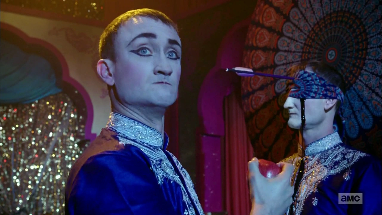
This illustration is inspired from my favourite scene with Fiore where he has a show in Vegas. The colours are very bright in these scenes, so I want to play with using big bold colours when I prepare it for screen print on PS. I added the chair and modified his outfit greatly, only the hat and shoes are similar to the scene they are inspired from, also, I designed the pose. Additionally he doesnt have wings in the show, but he is meant to be an angel. I added them because I believe it gives the composition and the character a sense of drama and balance.


Wednesday, 18 October 2017
Inktober Designs
This is an issuu file for the illustrations I did for Inktober. This has been a challenging yet stimulating challenge that has allowed me to produce work in a very limited time frame and with one particular medium. I have produced some work that I am extremely proud of and others that I wish I didn't have to post on here. Another good thing that has come about is that it helped me decide to do my COP comic wish brush and ink, and given me a bit of bravery to experiment.
I did not manage to make it the 30 days however. And posting each and every image on my IG account was nerve-wracking with the images that i wasn't happy with.


Monday, 16 October 2017
Initial Statement of Intent
For this year I intend to build on the techniques I started developing and practiced last year. I would also like my portfolio to reflect the direction I want my career to take. Last year I really wanted to develop my comic skills and for Cop this year I plan to make something along those lines.
For 603, however, I would prefer my practice to be process driven. The processes I would like to develop this year are screen printing, use of colour, and penmanship. I want to pick briefs that will showcase my passion for book illustration, films, and nature. Hopefully the combination of these techniques and topics will lead to a clear and focused body of work at the end of the year. I have a few briefs in mind, some self initiated and some competitive. I’d prefer to have a balanced combination of both forms of briefs at the end of this year.
There are three main briefs I am interested in completing this year:
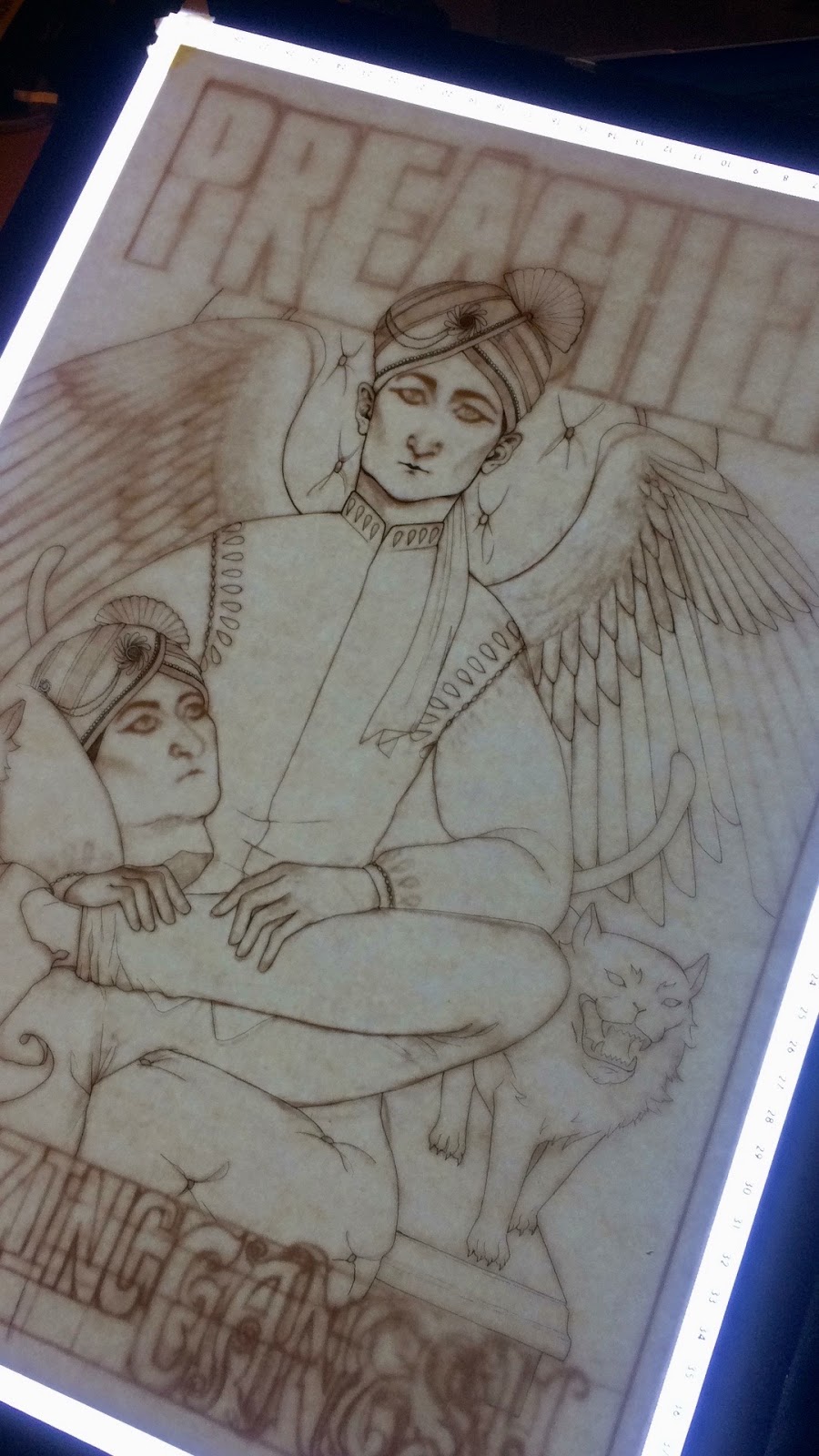
The first brief I am considering is the Preacher PosterSpy brief. I am familiar with the series and the comic, and a big fan, so I am excited to try my hand at poster making which is something I haven’t attempted before. Combining text and image on a poster will test my typography skills, my compositional skills and colouring skills. Immediately for this brief I know I want to use screen printing. It will make my final image look really finalized and professional, also I would like to try to work at a large scale, possibly even A1.
The Folio Society- Sherlock Holmes brief is interesting as well. At the end of this year I hope to have illustrations that highlight my interest in book illustration. Having researched the Folio Society’s previous entries and other projects, I believe my style will work well for this project. I am hoping that I can manage juggling a big project like this alongside my dissertation.
The final brief that I believe will add a lot to my portfolio but also be a learning curve in my practice is illustrating the novel Naked Lunch by William S. Burroughs. The nature of this book is one of surrealism and I would like the opportunity to break out of my illustrative shell a bit and design some out of the box images. I haven’t read the book yet so it will have to be after Cop submission. This is one of the briefs that excites me most however.
Coming into this course in at level 5, with very limited knowledge of illustration as its own professional practice has been a challenge. Meditating over what I felt were my shortcomings last year has led me to pick these projects. I really hope to have accomplished all my goals by the end of this year and to put together a body of work that represents who I am as an artist and where I want to take my professional practice.


Preacher
Posterspy Competition

 I have seen this brief that has really gotten my interest. I am a big fan of the Preacher comic and tv show. I am really busy and behind on my dissertation but would love to still give it a go. I immediately think of my favourite characters that i would like to showcase, characters that are not considered lead roles, but that are fan favourites for sure. The first one is The Amazing Ganesh, Fiore. and the second is Herr Starr. They are very interesting looking characters as well.
I would like to make this a process driven brief in the sense that I want to design the illustrations to read well as screen prints. I want to develop skills in this last year that will be beneficial to different forms of application in the future. Screenprinting may help me develop good color schemes and think more graphically. Also, i would like to develop lay out skills with text and image.
Sunday, 15 October 2017
Monday, 8 May 2017
Evaluation
This project has been a great experience; it has given me the opportunity to do, as professionally as possible, something I have never done properly before; book publishing. I have always been interested in book illustration among other things. For a long time I wanted to be a professional free-lance book illustrator, and it is something I still consider as a possibility. The world of freelance artists is a tough one but the rewards are great if you really succeed.
I started this project with a clear idea that I wanted to illustrate a book or a comic. I was working on my comic for responsive and was advised against doing something so time consuming. In the end, I think that was definitely wise advice. Although I finished all my work, I definitely felt the crunch towards the end of this module and I would’ve loved to have even just another month to apply myself to it, simply developing more imagery and styles. I had never read The Jungle Book so a lot of my time was applied to reading it, becoming familiarised with the themes and doing research into a whole new culture that I knew little about. As well as learning about book publishing, and researching basic dos and don’ts.
The area where I have made most progress is research and drawing. I researched previous illustrators that worked on this novel, as well as learning about the real life aspect of the novel itself. Learned about its origins, its writers, and the real locations of where it is set. My drawing improved tremendously. Originally I am more of a character illustrator and I never really draw my characters in any environments. In this project I really thought about the characters as well as their surroundings and their place within it. I thought about composition and the way my images would lead the viewer’s eyes through the page. I thought about the context, the scenes described in the books and did my best to bring in all the elements described in the book into the images. It is something that I set out to do from the start and considered greatly in my thumbnails. I am terrible at drawing architecture and perspectives, and with my temple scene I think I truly succeeded in drawing a realistic building as well as incorporating my characters within that environment successfully. Another area where I feel I have done well is researching the animals that are in the story. In the case of Baloo, in the animated film he is pictured as a random grey bear, in the live action rendition he is a brown bear. Although there are brown bears in India, I learned that they are indigenous to higher altitudes and mainly live in the Himalayan range. And I learned that the sloth bear is indigenous to areas near the Seoni region so that is why I decided to use the sloth bear.
Another area where I did well was in application to promotional products. I did not have as wide of a variety of applications as some other people on my course, but the ones I did have came out well. And even though I had less overall, there was more range within the applications. I did multiple canvas bag designs, and multiple bookmarks. The tiger and jackal designs were taken from illustrations I did in my sketchbook, they were expanded on and made to look like a real product, which I think was a real success.
The hand drawn typography for my cover is one of my favourite aspects of my final designs. I am not good with typography and doing a design that involved such an illustrative element was a good way to apply something I’m good at to something I’m not so good at. I do wish had expanded more on the text. Once applied, it seemed a bit thin and a bit too minimal. But I think the lettering itself was very strong and I want to develop it as a font in the future.
The areas where I didn’t succeed is time management. Because, if I had managed my time better, I would have been able to do more experimentation and I would have been able to design a better cover and slipcase. Originally I wanted to do an indian floral pattern with animals for the slipcase but I didn’t have the time to develop that idea. I also wanted to include colour in my illustrations themselves, but because of lack of time I failed to do that. I don't think the illustrations are bad, but as an artist and for the sake of my practice I should have gone that extra step.
Sunday, 7 May 2017
Saturday, 6 May 2017
Development of Type for Cover and Influence
I really enjoyed doing the font for the cover design. It was rewarding t obe able to use a bit more illustration within the shapes and I discovered the book New Illustration With Type which was a fun read and exposed me to a bunch of cool new types of illustration and design.
I only wish I had developed the drawing a bit further. All in all a success though. It ended up producing a nice clear, and above all, legible cover.
Friday, 5 May 2017
Feedback
Here's what people wrote on the last Megacrit
Comment on the quality and quantity of the final images/products and their proposed applications
-Babe you're fab
-Detail on fleek
-Nice level of production on your final images. I like the way your text is coming along, definitely continue with this method
-The large temple scene is out of this world
-You are a bloody magician, these are magic
-Wow, such great illustration. Texture and realism really bring the theme together.
-Images are stunning
-So gorgeous
-I like the mix of black background and detail
-Your work are always super detailed and fine quality. I love all of them
Give constructive feedback on ways these deliverables could be strengthened
Throw some vines in to the text, I feel it would strengthen the form of the letters
-Yes, vines and leafy things
-I agree
-Design boards and I think they will look nice as posters and prints
I really agree with the suggestions that I should add vines and leaves. It would make the title more dynamic. I will try to include it once I have finished the insects. The insects take a long time and I've invested a lot of effort so far on them that I think I should finish them as is and see once they're done where I can add the vines/leaves. Hopefully there's time!
Thursday, 4 May 2017
Book Slipcase Design and Development
Out of all my images and production I feel I really landed short on this design. I really wanted to do an intricate floral design, super colourful and dynamic which included the jungle book characters. Unfortunately, when I was developing the design through sketches I realised I was going to need a lot more time for this type of illustration and I really rather have a decent one that I could do quicker over a messy rushed one that didn't live up to what I had in mind.
I do think there are aspects to it that are nice. Its a repeat pattern and the way I have drawn it I think captures a bit of the chaoticness of the monkeys in the story. Although the more I look at it, the more I am not sure about the colour scheme. Perhaps a sunflower yellow would have been more fitting. Or a burnt sienna tone.
Monday, 1 May 2017
Grayson Perry
Grayson Perry is predominately known as a ceramic artist but has produced works in many media.
I would argue however that the theme that connects all his work is narrative illustration.
His surface designs combine drawing and collage normally focused on on themes to do with contemporary western culture - celebrity, social media, people's infatuation with football and their own identity and our cultures identity.
But also themes that speak to everyone, love lose and death.

But also themes that speak to everyone, love lose and death.

I have always enjoyed sculpture and would like to experiment with surface design.
They way Grayson Perry works on the vases he makes is quite unusual. they are very much contemporary versions of ancient Greek vases that tell stories of the gods and great warriors.

Creating a piece of illustration on another piece of art can be a great way of adding to the work.
When analyzing artwork and films and music it is important to understand what part of the world the artist was on and when, this allows us to try to see the context behind the work to deepen our understanding of the artists message(s)
I don't completely know what I am getting at but if I were to decorate a sculpture with illustrations I believe I could create some very captivating art.
The stories that his work tells are like that from the media. normally crass and literal. But still he leaves the exploration of meaning to the viewer.
People say, ‘why do you need to put sex, violence or politics or some kind of social commentary into my work?’ Without it, it would be pottery. I think that crude melding of those two parts is what makes my work.”
He is a prolific artist and made a name for himself through post university exhibitions and his flamboyant alter ego.
He won the 2003 turner prize,
He has written books on art.
Winner of the 2003 Turner Prize, British artist Grayson Perry creates seductively beautiful pots that convey challenging themes; at the heart of his practice is a passionate desire to comment on deep flaws within society. Perry uses pots as narrative and figurative media, a round, curved surface for a bizarre or bitter story
Development of Temple Drawing
This drawing took me the longest.
I used a mixture of fineliner, pencil, brush, and ink. There was quite a bit of referencing for the temple which I got from a picture online of a temple situated in the district of Madhya Pradesh. I do not intend to ever sell this drawing.
I am very happy with the composition and placement of the characters, foliage and architecture.
I wish I had developed some nice use of spot colour within the illustration to make the front characters pop.
Saturday, 29 April 2017
Friday, 28 April 2017
Holly Lucero
Holly Lucero is a 20 year old Art student studying California.
Her work has captivated my imagination and inspired me to rethink about what outcomes I would like to produce at level 3.

She produces beautifully hand rendered colour illustration of dogs and imaginative beasties that would capture anyone's attention.

She has inspired me to be more explorative in my illustrations and combine features and elements of subjects to create something unique.
I also really like how she exaggerates features and posture to give life and personality to her illustrations.
She shares her Illustrations on tumbler and sells commissions for the prices below:
Large + Colored - $100+ USD (X)
- 100 for a digitally scanned image, 300 for a shipped out image. This will be done in A4 sized paper.
Medium + Black ink or Colored - $50 USD (X)
Drawings will be scanned and sent digitally
Won’t draw: Anything sexual - nudity is fine, but nothing explicitly sexual. At the moment I’d prefer not to draw humans.
I really need tet up my own website like this
Merchandise Inspiration
I found a website for a company called Strand Books which has a large number of books and limited editions, but furthermore they have a variety of merchandise that go with the books. They have a cool range on Frida Khalo and other fun items.
Its really given me good ideas on what products I actually want to make to promote my work and what makes sense. I decided I want a physical line, and things that I personally would enjoy as well. I really like bookmarks, I like the idea of canvas bags because, if in only a small way, they help against pollution and waste.
As well as a range of limited edition prints may look good with the types of illustrations I am developing.


Thursday, 27 April 2017
Wednesday, 26 April 2017
Independent Book Publishing

Through my research I found a good list of independent book publishers. I didn't realise it was such a big thing, especially with such large powerhouses of corporate publishers in this day and age.
But apparently people are still fighting the power and managing to maintain their small businesses and building up smaller scale companies for book publishing which is really cool. I think these days as well you have to be really good at what you do to do something like independent book publishing and stay afloat. But more and more people search for the independent manufacturers in all areas f production so maybe it isn't such a surprise.
Below is a link to the website along with some of the publishers n the list
By Flavorwire
-Akashic Press- 'Go the fuck To Sleep' by Adam Mansbach. Bestselling book published by this publisher
-Coffee House Press
-Black Balloon Publishing- right up my alley, they like to publish quite weird work, which is cool!
-The Feminist Press
-Two Dollar Radio
Really awesome list of publishers and their info, highly recommend a read.
Sunday, 23 April 2017
Final Comic Outcomes


I am really pleased with my final outcomes for my comic. I have put a lot of effort into having it completed well and have spent a lot of time developing the content, including characters, plot line, back story. Additionally I have tried to adhere to the comic guidelines as recommended by all the comic rules that I came across in my research.
I think the tone of the comic is successful and the mediums I used are quite nice. I think the characters are pretty true to the sketches I had come up with, especially since I find reproducing the characters within their panels to be one of my biggest challenges. I do think I definitely still need practice. I am not totally happy with the way the big panels with the small characters came out. I think they look flat, and a big muddy within their surroundings.
Things to improve on for my final draft include:
Lettering: I would like to do most my comic by hand in the future and then polish it off on photoshop, using digital font instead of trying to recreate it.
Small characters: Perhaps I would draw individual panels that require small characters at a larger scale and then put the page together on photoshop.
Golden Ratio: I would definitely like to improve with using the Golden Ratio, it definitely seems to be the way to go when designing your layout.
Because of all these reasons I will probably re-draw these first few pages, either later this year or during the summer when I complete this whole chapter. I would really like to do this idea justice, because in the long run, after a few chapters I think it could actually be a really good comic, if only I learn how to execute it properly.
Saturday, 22 April 2017
Research of Type and Lettering
I have never been any good with lettering and so I started looking through one of the books I have on my bookshelf, which has actually been a godsend. It is called New Illustration with Type.

It is a blend of type and illustration, type as illustration and type made up of illustration
I am interested in the latter. I think it is very interesting to build up font out of individual drawings and some examples they have in this book are really interesting.
It allows me to incorporate illustration into font in a very literal way, and as well, I think it could make for a relevant and fun cover.
Below are some examples of the fonts I could include


Wednesday, 19 April 2017
Research of Flora
Flowersofindia has been really helpful when trying to visualize what foliage will go into my drawings. They have an encyclopedia of images. The regions of where the plants grow and numerous photos for each one. Really helpful website
It helped my find the kulu (ghost) tree and also the grass that Mowgli is surrounded by is a type of grass native to India as well named Cogon grass

Tuesday, 18 April 2017
Article by National Geographic
Found this interesting article by National Gergraphic on how at least one species of creature in The Jungle Book may already be extinct.
This is really tragic. I feel like we are living in an ages where surely we will see the most drastic extinction of animals ever recorded. Not only because of the factors taking place, weather, poaching etc. But because we are living in the age of worldwide information and people are aware of endangered animals at a scale that has never been known before.
For this reason I think popularising books like the Jungle Book and watching nature shows, like avid Attenborough is supremely important. Its not like a wwf ad where youre guilted into saving the whales, but instead you form a bond with the characters in these books or you learn about other magnificent lives and habit and intelligence.
I have always loved wildlife and that is a driving factor as to why I picked this book to illustrate. It not only gives you a magical imaginative peek into the life of the jungle and all its creatures but it has social and almost political parallels to our own society, which is very cleverly done. As well as in the short stories at the end. The story of Kotick the Seal is definitely a shout for the halt of the seal fur trade and goes into vivid detail of the violence and horror of it.
below is the link, highly recommend a read
Saturday, 15 April 2017
Jin Xingye
I found this Artist on culturenlifestyle.com
http://culturenlifestyle.com/post/159547013116/jin-xingyes-lovely-dreamlike-illustrations
The illustrations really appealed to me. I have been drawn to Surreal illustrations that allow the viewer to decide the narrative for as long as I can remember.
I always feel I struggle to successfully design and compose images that can communicate my thoughts to the viewer.
What I particularly like about Jin Xingye's work and what to explore my practice is this increased level of ambiguity. So that I am not be literal in my illustrations, telling the viewer my opinion, or forcing them to ask one or two specific questions.
I feel that Jin Xingye's illustration's feel very dreamlike and depending on the viewers own opinion could be innocent dream inspired illustrations or could have contemporary, relevant even political messages.
Perhaps ideas around climate change, extinction, modern mans uncertain identity, the absurdism of contemporary mechanized life.

I love how children's book illustrators often inspire reflection and contemplation in simple ways from art that is accessible for people of all ages.
Jin Xingye has very little presence online but that could be due to the fact the Art is based in China but his work has popped up on many different websites since April 2017.
Readin the limited articles about the Artist it seems that he is a Children's book illustration but I have been unable to find any examples of published work by the artist.
Study Task 2
Peter Diamond
Peter Diamond is a Canadian artist who has worked on album covers, posters, apparel and editorial illustration. He is award-winning and is based in Vienna, Austria. He's exhibited in Berlin, London, New York, Vienna, Adelaide and Halifax. He's worked for websites like Juxtapoz, Comics Alliance, Squidface & The Meddler.
He did a recreation of the illustrations Little Nemo in Wonderland which are some of my favourite drawings, originally illustrated by Winsor McCay.

His work is mixed media, sometimes he works traditional but almost always finishes his illustrations digitally.
He is very well known and has strong online presence and website.

Hs works are something I would like to draw upon, he has a really nice figurative line and style but also has an amazing sense for colour and finished his digital illustrations at an amazing level . Very clear he is influenced by Japanese art, which I also really enjoy.


I see a lot similarities in his work to Yuko Shimizu and Kim Jung Gi.
Saturday, 8 April 2017


Friday, 7 April 2017


Monday, 3 April 2017
Comic Page Script
Below is the script of the 4 pages I will be illustrating. I had written out the full script but through development and editing I have decided to change quite a bit towards the end so I will only put up the first 4 pages
I didn't stick to it to heart, but it helped to figure out the rhythm of the panels and to visualize what would be included on which page. Also, visualizing it helped me design how two opposite pages would complement each other.
*
PAGE 1
Front of Strip Bar with bouncer in view.
Couple of people talking.
Anna Walks in left.
PANEL 2.
Bouncer Nods to Anna
(Close up)
PANEL 3.
(Zoom out)
Anna walks by and waves
PANEL 4.
(Aerial Shot) Anna Turns into alley
*
PAGE 2
PANEL 1.
Anna in dark alley next to dumpster
PANEL 2.
Anna inhales from cigarette
PANEL 3.
Close up of lit cherry (FX)
PANEL 4.
Anna exhales smoke
PANEL 5.
Anna, hand on wall, throws up
(FX) *COUGH*
PANEL 6.
Anna hand on wall“Goddammit"
+PAGE 3.
PANEL 1.
Anna quickly opens side door, steps through
PANEL 2.
View of door slowly closing. Ominous shadow on floor
PANEL 3.
(MED PANEL)
Hallway of Strip bar
PANEL 4.
Woman leaning on Wall
“YOU’RE LATE”
PANEL 5. Woman walks out into bar.
PAGE 6.
PANEL 1.
Establishing Shot of inside Strip bar
PANEL 2.
Lonely man sitting at bar. Big man at end of bar watching stage.
PANEL 3.
(Zoom)
Man stares at empty drink
PANEL 4.
Bartender asks
“ANOTHER SODA LEMON HON?”
Man puts hand up, smile
“NO, THANK YOU”
PANEL 5.
Man raises hand
“CANDY, BUY THIS MAN A DRINK ON ME”
Sunday, 2 April 2017
Rikki Tikki
In the short story Rikki Tikki, Tikki battled two spectacled cobras, Nag and Nagaina.


Interestingly, the origin of their names comes from Naga
Definition credit to the Encyclopedia Britannica
Naga, ( Sanskrit: “serpent”) in Hinduism, Buddhism, and Jainism, a member of a class of mythical semidivine beings, half human and half cobra. They are a strong, handsome species who can assume either wholly human or wholly serpentine form and are potentially dangerous but often beneficial to humans. They live in an underground kingdom called Naga-loka, or Patala-loka, which is filled with resplendent palaces, beautifully ornamented with precious gems. The creator deity Brahma relegated the nagas to the nether regions when they became too populous on earth and commanded them to bite only the truly evil or those destined to die prematurely. They are also associated with waters—rivers, lakes, seas, and wells—and are guardians of treasure.

Saturday, 1 April 2017
Study Task 2

Yuko Shimizu

Yuko Shimizu is a Japanse artist. She works mainly in ink and brush, with a modern twist on traditional Japanese media. She has won awards and was mentioned in 100 Japanese People the World Respects
Her work is published in magazines and in books and she also has her own class on the digital platform SkillShare, which is where I discovered her. She did a whole twelve episode class on painting with brush and ink, which I did during 504: About the Author
Her work is featured on The Gap T-shirts, Pepsi cans, VISA billboards, Microsoft and Target ads, as well as on the book covers of Penguin, Scholastic, DC Comics, and on the pages of NY Times, Time, Rolling Stone, New Yorker and in many other publications.
She teaches you everything about working with her favourite medium, from the selection of brush and ink and paper, to homework on markmaking and assigning tasks such as creating an image with a total of 6 textures created with brush and ink.
Her work inspires me because not only is she successful but she gained that success originally with just using traditional media and stated with black and white images, she then started using colour and digital programs to enhance her work all while establishing her career. She gives me the sense that its never too late and also that you should always keep improving whether that be in uni or when you are already well known or have a successful career. There may be the fear of producing work that is further from what helped you establish your profession, but as long as it is quality work, you should always find success. She was also very modest and a patient teacher in the videos I saw. Really nice sounding lady.
Comic Page Layout and Flow
I found a website called Making Comics that explains a very cool system in comics called the golden ratio. Essentially it looks like this

This form of layout helps the artist develop good sense of rhythm, balance and direction. It is something I would like to incorporate into my comic.

Subscribe to:
Comments (Atom)