I am really pleased with the outcome of my proposal. I think adding colour to the image was a great decision. It was a bit rushed, I intend to spend a lot more time on these images and finish them by hand in time for the show. There are designs that are purely experimental, such as the images with the huge red logo across them. I did them half joking, but afterwards I found them intriguing. As if the over-the-top logo makes them more eye catching.
I didn't add any other type of product placement because I didn't want the message to be something 'purchasable'. I wanted the message of the images as advertisements to be something pleasant, a free message that hopefully helps brighten up someone's day or a space. Not something that could be considered coercive or obligatory. A type of advertisement that isn't selling anything. I wanted the images to be for free in a sense, not for sale as a sort of innuendo to the problem that often comes about out of situations like loss of jungles, forests, ecosystems.
Wednesday, 16 May 2018
Summative Evaluation
I had clear goals for this academic year and those were to have a concise body of work that I was proud
of; developed through experimentation of new media and techniques, that then reflected what my hopes
for a future career in illustration involved.
of; developed through experimentation of new media and techniques, that then reflected what my hopes
for a future career in illustration involved.
I like to think I let the briefs develop more organically rather than stick to a strict structure.
Regardless, I did have a list of briefs that I intended to complete, briefs that I had chosen
because I thought they would help me achieve those goals.
Regardless, I did have a list of briefs that I intended to complete, briefs that I had chosen
because I thought they would help me achieve those goals.
I did start off with the Alice in Wonderland editions brief, which was in my original list, and
I did stick to my own guidelines which was to let the project be process driven. In the end,
the success lay in the fact that I did, through trial and error, produce at the very least, one
finished screenprint. Through that experience I learned a lot about the dos and don'ts of design,
composition, and the behaviours and effect of the medium. Also to triple check you properly
save your files on photoshop. The successes of the design I ended up producing, in my opinion,
were that the image, though not necessarily a strong screen print item would possibly work better
as a image for product design, possibly as a bag.
I moved on to my Preacher poster design, which was very exciting. I was struggling with Cop
however, at the time, which meant that the deadline would be very hard to meet. I developed
my initial design very quickly but then struggled with the production of it. I spent a lot of time
researching other posters and considering colour schemes. Because as much as I enjoyed
my design, I knew it would be tricky to colour. I was inspired by 70s psychedelia posters and
thought that, because they would have most likely been screen printed themselves they would
be good images to sample colours from and experiment in Photoshop. Through Cop, and these
projects, I have improved my photoshop skills considerably. I find that to be a great achievement
this year. I really dreaded coming to university know how to draw, and leaving university still just
knowing how to draw. By nature, I shy away from unknown techniques and processes, and feel
comfortable with what i know, so I have found this year to be a confidence booster in that department.
I tried to do Folio Society Sherlock Holmes brief. I do want to try book publishing as a career
in the future so I thought it was crucial that I focus a lot of energy on that project, which I did do.
Unfortunately, I had a lot of outside pressures, including Cop, that affected me. Ultimately I had to
drop that brief. I think out of all my mishaps this year, that was my biggest missed opportunity.
Although I am not huge fan of Sherlock, I did the research and developed images that I was really
set on expanding on. I will keep an eye out for Folio Society briefs in the future.
My pride and joy this year has been the self initiated brief I wrote. After designing the proposal,
it felt as if I had clear direction, motivation and time to really dive into this project. It began with
lots of research. One of the best parts of any brief to me is the research. I find I need and enjoy
the confidence of knowing that I am approaching a project knowledgeably and correctly.
It gave me the chance to really consider what I wanted the outcome to be like and what I thought
was most important to my practice and to my portfolio. I really wanted to build some watercolour
skills, and I did do quick tests and sketches, but I decided in the end that I had done a lot that was
out of the norm for me, and I really wanted to present work that was in a fashion that has been a
staple throughout my years drawing. Fineliner has always been one of the key ways I work. I did
not manage to complete all the illustrations, but they will be an ongoing project, ready in time for
Hanbury exhibition. Looking back to when I began the course, I don't think I could’ve made
compositions as successfully as I did for this project. And i think my attention to detail has gone
up as well. The only thing that has been a constant since I started university, has been time
management. This year I feel I let myself down with the way I managed my time. I hope that these
skills that I have improved on will only keep improving and that I have produced work, and will
continue to produce work, that will facilitate my chances of employment in the future
IUCN
I have also quickly started a colour experiment with the images. They seem a little flat as posters so maybe adding colour of PS will make them pop more.
Although I am not usually enthusiastic about adding colour to my handmade work digitally, i do think on this occasion it is quite successful so far. If I have time I may try and colour them all in and update the mock ups Ive done.


Although I am not usually enthusiastic about adding colour to my handmade work digitally, i do think on this occasion it is quite successful so far. If I have time I may try and colour them all in and update the mock ups Ive done.


Tuesday, 15 May 2018
IUCN Mock Ups
I have made progress on the PS editing I am doing to my images, they are now ready for mockups.
I am pleased with the way they are coming out. I need to find some more templates for the images, so far I only have a couple ones of bus stops. Ideally I would like to have a museum banner mock up, some notebook covers and bookmarks (things you may find in a museum gift shop) and possibly some templates of underground advertisements as well.


I am pleased with the way they are coming out. I need to find some more templates for the images, so far I only have a couple ones of bus stops. Ideally I would like to have a museum banner mock up, some notebook covers and bookmarks (things you may find in a museum gift shop) and possibly some templates of underground advertisements as well.


Sunday, 13 May 2018
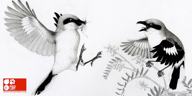
IUCN
I have drawn till the last possible day and still have not finished both illustrations, let alone the 3rd. Although I am happy with the designs, I do wish I had made more progress. For the past 2 weeks I have been drawing for 10-13 hours a day. I cannot believe I am not done yet. what did I get myself into.
Because the major element of this self initiated brief was to make an imaginary IUCN Red List of Endangered Ecosystems campaign, I intend to finish the illustrations on PS for the sole purpose of having decent looking mock ups. Below are some images of the progress and process im doing on PS


Because the major element of this self initiated brief was to make an imaginary IUCN Red List of Endangered Ecosystems campaign, I intend to finish the illustrations on PS for the sole purpose of having decent looking mock ups. Below are some images of the progress and process im doing on PS


Friday, 11 May 2018
Preacher Digital Finals
I am extremely happy with the finished digital designs! The posters make a lot more sense as a series now compared to my initial drawings which were quite different, both stylistically and compositionally.
I am happy that I opted out of including the character names within the illustrations, this and the Ganesh digital illustration. Typography is not my strong suit and I think it showed. I am really happy with the title as well, i opted to use actual font rather than my original hand drawn title. I did think the original title had cooler letters but this looks crisper; and when I turned my original title white, it didn't look as good.
I really like all the colour schemes. I the end I think my favourite is the tile poster which was a happy accident just trying different things on PS. I decided to put the halo around his head because of the characters narrative plot in the show. He is trying to find the next messiah, and believes it is Jesse. I think it is quite ironic to place it on him, so I did.
The gap at the bottom of the design was where I was going to write out his name by hand. I left it there because I found that it made for a slightly more interesting image. His character in the comic is very sexual and i thought that that little gap at the bottom was a nuanced way of accentuating that.
Friday, 4 May 2018
Tutorial

Had some grounding advice from Teresa. I can see I wont be able to finish these 3 illustrations on time, they are taking way longer than expected. She recommended I work to a reasonable level and then finish them on PS for the hand in. I will definitely be doing this. I would also like, if I have time, to colour one or both images. I do like the black and white aesthetic, but I feel like when I use them on mock mps they might fall flat. Will cross that bridge when i get to it though. At the moment I just need to keep on drawing.
Preacher Digital Finals
Have been playing around more with my Preacher poster. I think the lines were too thick in my previous design, they overpowered my illustration. I really wanted to stick to the colour palette that I experimented with in my PS process for the screen print design. I have decided to leave the Herr Starr as a stand alone character within the poster design because I think that with this simplified version of Ganesh the designs will work out better as a set.
Subscribe to:
Posts (Atom)