I am really pleased with the outcome of my proposal. I think adding colour to the image was a great decision. It was a bit rushed, I intend to spend a lot more time on these images and finish them by hand in time for the show. There are designs that are purely experimental, such as the images with the huge red logo across them. I did them half joking, but afterwards I found them intriguing. As if the over-the-top logo makes them more eye catching.
I didn't add any other type of product placement because I didn't want the message to be something 'purchasable'. I wanted the message of the images as advertisements to be something pleasant, a free message that hopefully helps brighten up someone's day or a space. Not something that could be considered coercive or obligatory. A type of advertisement that isn't selling anything. I wanted the images to be for free in a sense, not for sale as a sort of innuendo to the problem that often comes about out of situations like loss of jungles, forests, ecosystems.
Wednesday, 16 May 2018
Summative Evaluation
I had clear goals for this academic year and those were to have a concise body of work that I was proud
of; developed through experimentation of new media and techniques, that then reflected what my hopes
for a future career in illustration involved.
of; developed through experimentation of new media and techniques, that then reflected what my hopes
for a future career in illustration involved.
I like to think I let the briefs develop more organically rather than stick to a strict structure.
Regardless, I did have a list of briefs that I intended to complete, briefs that I had chosen
because I thought they would help me achieve those goals.
Regardless, I did have a list of briefs that I intended to complete, briefs that I had chosen
because I thought they would help me achieve those goals.
I did start off with the Alice in Wonderland editions brief, which was in my original list, and
I did stick to my own guidelines which was to let the project be process driven. In the end,
the success lay in the fact that I did, through trial and error, produce at the very least, one
finished screenprint. Through that experience I learned a lot about the dos and don'ts of design,
composition, and the behaviours and effect of the medium. Also to triple check you properly
save your files on photoshop. The successes of the design I ended up producing, in my opinion,
were that the image, though not necessarily a strong screen print item would possibly work better
as a image for product design, possibly as a bag.
I moved on to my Preacher poster design, which was very exciting. I was struggling with Cop
however, at the time, which meant that the deadline would be very hard to meet. I developed
my initial design very quickly but then struggled with the production of it. I spent a lot of time
researching other posters and considering colour schemes. Because as much as I enjoyed
my design, I knew it would be tricky to colour. I was inspired by 70s psychedelia posters and
thought that, because they would have most likely been screen printed themselves they would
be good images to sample colours from and experiment in Photoshop. Through Cop, and these
projects, I have improved my photoshop skills considerably. I find that to be a great achievement
this year. I really dreaded coming to university know how to draw, and leaving university still just
knowing how to draw. By nature, I shy away from unknown techniques and processes, and feel
comfortable with what i know, so I have found this year to be a confidence booster in that department.
I tried to do Folio Society Sherlock Holmes brief. I do want to try book publishing as a career
in the future so I thought it was crucial that I focus a lot of energy on that project, which I did do.
Unfortunately, I had a lot of outside pressures, including Cop, that affected me. Ultimately I had to
drop that brief. I think out of all my mishaps this year, that was my biggest missed opportunity.
Although I am not huge fan of Sherlock, I did the research and developed images that I was really
set on expanding on. I will keep an eye out for Folio Society briefs in the future.
My pride and joy this year has been the self initiated brief I wrote. After designing the proposal,
it felt as if I had clear direction, motivation and time to really dive into this project. It began with
lots of research. One of the best parts of any brief to me is the research. I find I need and enjoy
the confidence of knowing that I am approaching a project knowledgeably and correctly.
It gave me the chance to really consider what I wanted the outcome to be like and what I thought
was most important to my practice and to my portfolio. I really wanted to build some watercolour
skills, and I did do quick tests and sketches, but I decided in the end that I had done a lot that was
out of the norm for me, and I really wanted to present work that was in a fashion that has been a
staple throughout my years drawing. Fineliner has always been one of the key ways I work. I did
not manage to complete all the illustrations, but they will be an ongoing project, ready in time for
Hanbury exhibition. Looking back to when I began the course, I don't think I could’ve made
compositions as successfully as I did for this project. And i think my attention to detail has gone
up as well. The only thing that has been a constant since I started university, has been time
management. This year I feel I let myself down with the way I managed my time. I hope that these
skills that I have improved on will only keep improving and that I have produced work, and will
continue to produce work, that will facilitate my chances of employment in the future
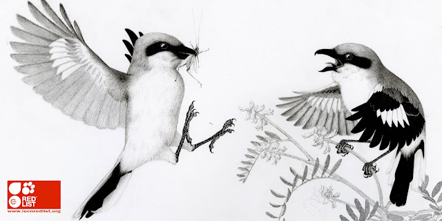
IUCN
I have also quickly started a colour experiment with the images. They seem a little flat as posters so maybe adding colour of PS will make them pop more.
Although I am not usually enthusiastic about adding colour to my handmade work digitally, i do think on this occasion it is quite successful so far. If I have time I may try and colour them all in and update the mock ups Ive done.


Although I am not usually enthusiastic about adding colour to my handmade work digitally, i do think on this occasion it is quite successful so far. If I have time I may try and colour them all in and update the mock ups Ive done.


Tuesday, 15 May 2018
IUCN Mock Ups
I have made progress on the PS editing I am doing to my images, they are now ready for mockups.
I am pleased with the way they are coming out. I need to find some more templates for the images, so far I only have a couple ones of bus stops. Ideally I would like to have a museum banner mock up, some notebook covers and bookmarks (things you may find in a museum gift shop) and possibly some templates of underground advertisements as well.


I am pleased with the way they are coming out. I need to find some more templates for the images, so far I only have a couple ones of bus stops. Ideally I would like to have a museum banner mock up, some notebook covers and bookmarks (things you may find in a museum gift shop) and possibly some templates of underground advertisements as well.


Sunday, 13 May 2018
IUCN
I have drawn till the last possible day and still have not finished both illustrations, let alone the 3rd. Although I am happy with the designs, I do wish I had made more progress. For the past 2 weeks I have been drawing for 10-13 hours a day. I cannot believe I am not done yet. what did I get myself into.
Because the major element of this self initiated brief was to make an imaginary IUCN Red List of Endangered Ecosystems campaign, I intend to finish the illustrations on PS for the sole purpose of having decent looking mock ups. Below are some images of the progress and process im doing on PS


Because the major element of this self initiated brief was to make an imaginary IUCN Red List of Endangered Ecosystems campaign, I intend to finish the illustrations on PS for the sole purpose of having decent looking mock ups. Below are some images of the progress and process im doing on PS


Friday, 11 May 2018
Preacher Digital Finals
I am extremely happy with the finished digital designs! The posters make a lot more sense as a series now compared to my initial drawings which were quite different, both stylistically and compositionally.
I am happy that I opted out of including the character names within the illustrations, this and the Ganesh digital illustration. Typography is not my strong suit and I think it showed. I am really happy with the title as well, i opted to use actual font rather than my original hand drawn title. I did think the original title had cooler letters but this looks crisper; and when I turned my original title white, it didn't look as good.
I really like all the colour schemes. I the end I think my favourite is the tile poster which was a happy accident just trying different things on PS. I decided to put the halo around his head because of the characters narrative plot in the show. He is trying to find the next messiah, and believes it is Jesse. I think it is quite ironic to place it on him, so I did.
The gap at the bottom of the design was where I was going to write out his name by hand. I left it there because I found that it made for a slightly more interesting image. His character in the comic is very sexual and i thought that that little gap at the bottom was a nuanced way of accentuating that.
Friday, 4 May 2018
Tutorial

Had some grounding advice from Teresa. I can see I wont be able to finish these 3 illustrations on time, they are taking way longer than expected. She recommended I work to a reasonable level and then finish them on PS for the hand in. I will definitely be doing this. I would also like, if I have time, to colour one or both images. I do like the black and white aesthetic, but I feel like when I use them on mock mps they might fall flat. Will cross that bridge when i get to it though. At the moment I just need to keep on drawing.
Preacher Digital Finals
Have been playing around more with my Preacher poster. I think the lines were too thick in my previous design, they overpowered my illustration. I really wanted to stick to the colour palette that I experimented with in my PS process for the screen print design. I have decided to leave the Herr Starr as a stand alone character within the poster design because I think that with this simplified version of Ganesh the designs will work out better as a set.
Friday, 27 April 2018
Research
Mount Roraima Tepui
Below are images that I am using as reference
Mount Roraima Tepui.
located in the southeastern corner of Venezuela on the Guiana Shield. It is not a mountain technically it is considered a plateau.

Greater Flowerpiercer
largest bird of its family, endemic to the Pantepui region, in southeastern Venezuela and therefore found on Mount Roraima. It feeds on primarily nectar and insects.

Rufous-collared sparrow
A widespread bird throughout the Americas, eats insects and seeds.

Monday, 23 April 2018
Saturday, 21 April 2018
Tutorial
 Signed up for a tutorial with Rose, had really wanted to talk to her since she started at Leeds. We had a joint group crit a while ago and I just thought she had really good feedback to give us.
After meeting with her I felt reassured about my choices of illustrations. She also had good advice on online courses I could take to help with the nature of my drawings. Also good compositional input which I struggle with.
Thursday, 19 April 2018

Friday, 13 April 2018
IUCN Development
Have been experimenting with fineliner process, ink and watercolour. I find it really hard to draw birds so I did a test with the cormorant that is going to be in my Alaskan Kelp Forest illustration. There were some definite successes with this process. I started out with fineliner, and used some promarker for the face. I then a little watercolour for the green and violet hues on the feathers of the bird topped with sumi ink for the body. I am really pleased with the result. the sumi ink gave almost feather like textures on the body.
I would like to do my final images in watercolour but im also torn because I would like to do it in fineliner as well. I think the octopus would be too challenging to do in colour.


I would like to do my final images in watercolour but im also torn because I would like to do it in fineliner as well. I think the octopus would be too challenging to do in colour.


Wednesday, 11 April 2018
IUCN Development
Watercolour tests
I am playing around with the idea of making all the images in watercolour. It is something I have always wanted to learn how to do. I have been watching online tutorials and doing exercises for painting botanical art. I cant say Im very good at it. Since I want a piece in my portfolio in the end that really shows what Im about and am good at, I might just opt for the fineliner. Below are some examples of my tests.
Friday, 6 April 2018
Research
Mount Roraima Tepui
FAUNA:
Greater Flowerpiercer (Diglossa Major) Size:16.5 cm (6.5 in)
Roraima Black Frog Size: 22 mm (0.87 in)
Odessa Rufomarginata (Beetle) Size: 15 mm
Jumonia Coenia (butterfly) Size: 2.5 in
Zonotrichia Capensis (bird) Size
Friday, 30 March 2018
Research
Mount Roraima Tepui
The animals I have chosen are endemic to one particular tepui in venezuela called Mount Roraima. These mountains are so steep and tall that they are as isolated as individual islands and have developed over thousands of years species that are endemic to each particular one. It is not the case for all animals and plants, but each have at least one animal or plant species endemic to them.
The flora and fauna I have chosen for this illustration are
Birds:
Greater Flowerpiercer (16 cm)
Rufous-collared sparrow (13-15 cm)
Mammals:
Roraima Mouse (8-10 cm)
Amphibians:
Roraima Black Frog (2.2 cm)
Insects:
Edessa Rufomarginata beetle (1.5 cm)
Junonia Coenia butterfly (5-6 cm)
Thursday, 29 March 2018
Research
Reference Photographs and Video links
Below are some examples of the images Im using to better understand the anatomy and exact appearance of the animals and plants for my Great Lakes Alvars image.
A relatively small bird that feeds largely on a diet of insects and depends on prairies as its main habitat for hunting. It is largely widespread around the US but the loss of prairies to farmland has affected the size of its population greatly in recent years. It is still, however, listed as an animal of 'least concern' on the IUCN List of Endangered Animals.


Loggerhead Shrike
A small yet quite predatory bird that has been donned its name due to the large size of his head in comparison to its body. It has also been called the Butcherbird because it has tendencies of eating field mice, lizards and other small birds among other creatures. Its nickname however comes because of its lack of talons, which is needed to eat this type of prey. It instead impales its prey on barbed wire or spiky trees where it is much easier to then tear it apart Despite this behaviour, throughout the year its diet in very largely comprised of insects and seeds.


Dwarf Lake Iris
This plant, like it name suggests is very small, reaching a height of roughly 10 cm. It is one of the life forms in this illustration that is truly threatened and lives in a region of the Great Lakes Alvars. I could not deduce, because there wasn't any information, if it has a direct relation to any of the other species chosen for the illustration. I imagine, as I've included species of butterfly, that these depend on the nectar of this flower to some extent and therefore directs the birds that feed on them. It is a stunning little flower.


Ram's head Ladyskipper
This is a very unusual small flowering plant that is also characteristic of the alvars. It is a type of orchid and considered very rare. The plant is considered threatened as well and it grows to a maximum height of 30 cm, but can flower at a younger maturity.

Cooper's Milkvetch
Yet another endangered plant that is found in the Alvars. This plant grows on prairie-woodland ecotone as well as riverbanks, ravines, and lakeshore. They grow up to 3 feet tall. This plant is a flowering and fruiting one. Its flowers are small and white.


Monday, 26 March 2018
Research
Great Lakes Alvars
Updated and final creatures list for second illustration of the IUCN Endangered Ecosystems list. I want to draw all my creatures to scale
Birds:
Upland Sandpiper (30cm)
Loggerhead Shrike (9 cm)
Insects:
Scudderia Septentrionalis (4.cm)
Conocephalus Saltans (1.3 cm)
Euchloe Olympia (4 cm)
Garita Skipper (1.5 cm)
Olive hairstreak (1.3 cm)
Plants:
Cooper's Milkvetch (1-3 ft in height 1/2 inch flower)
Dwarf Lake Iris (10 cm height 3-5 cm flower)
Ram's Head Lady Slipper (30 cm max height)
Friday, 23 March 2018
Research
The IUCN has posted a 'Green List' to highlight the positive changes that have occured in wildlife and nature preservation
This article is a breath of fresh air, and in my opinion, important. I believe that in the struggle for preservation and reform, especially if you want to keep people motivated and positive, the achievements and pay-off of efforts need to be highlighted as well in order to keep the population aware and not desensitised.
Good read, need more like it.
Tuesday, 20 March 2018
Rsearch
Last male northern white rhino died, the species is officially extinct.
The exctinction crisis is dire, and reform and change needs to happen. These topics matter to me and are something that I need to voice in my practice, and hopefully help in any way I can in the future.
Saturday, 10 March 2018


Friday, 9 March 2018
Preacher Print Session
I finally got around to the print room and did an afternoon session as a keyholder. I think my work on the Cheshire cat has really helped me prepare for this crazy demanding print. The size is around A3, and the linework again makes it so that I have to line it up perfectly, or close enough. I've put alignment dots on the positive so that I can get it as close as possible. But I didnt consider to leave enough of a white border for framing, so if i sell them they will have to have the dots in view. I am a bit disappointed but Ben says it isnt such a bad thing, that it makes the image more interesting, so I'm a bit reassured.
Wednesday, 7 March 2018
Tutorial

Had good feedback from Teresa today, want to explore colour. Also trying to think of processes that will be viable with the time left until submission. I originally wanted to do these drawings A2, now I see thats crazy. I am aiming to work in A3 and then blow the pictures up to a2, and possibly colour them afterwards.
Monday, 5 March 2018
Research
Article:The long read
‘A different dimension of loss’: inside the great insect die-off
Interesting article about the massive loss of insect population, which also mentions the 'sixth extinction'. Some scientists argue that insect populations are going extinct up to 100x faster than they would without human-caused effects on the environment.
"Everywhere, invertebrates are threatened by climate change, competition from invasive species and habitat loss. Insect abundance seems to be declining precipitously, even in places where their habitats have not suffered notable new losses. A troubling new report from Germany has shown a 75% plunge in insect populations since 1989, suggesting that they may be even more imperilled than any previous studies suggested."
Another article I have come across, also by the Guardian, is named: Insectageddon: farming is more catastrophic than climate breakdown
This article highlights how the more immediate danger to insect life on this planet comes from our agriculture techniques and habits. And it not only affects insects:
"According to the UN Food and Agriculture Organisation, at current rates of soil loss, driven largely by poor farming practice, we have just 60 years of harvests left. And this is before the Global Land Outlook report, published in September, found that productivity is already declining on 20% of the world’s cropland."
But anyone of my generation (ie in the second bloom of youth) can see and feel the change. We remember the “moth snowstorm” that filled the headlight beams of our parents’ cars on summer nights (memorialised in Michael McCarthy’s lovely book of that name). Every year I collected dozens of species of caterpillars and watched them grow and pupate and hatch. This year I tried to find some caterpillars for my children to raise. I spent the whole summer looking and, aside from the cabbage whites on our broccoli plants, found nothing in the wild but one garden tiger larva. Yes, one caterpillar in one year. I could scarcely believe what I was seeing – or rather, not seeing.
Friday, 2 March 2018
Research
Northern Sea Otter Reference
Have been looking at sea otter anatomy and photos of sea otters diving underwater. I think its going to be tricky to capture the way the light falls on them underwater and how the fur looks. Have to practice with paint and pen.
Anatomy photo


Reference photos


Thursday, 1 March 2018
Preacher Development
I have started illustrating the second poster design for my Preacher editions. Herr Starr is an unusual character. One who is definitely a villain but has some quirks. One of my favourite scenes is when he is in a training camp and he has to do a line-up with all the other applicants. He is standing shirtless and you see that this very serious character has a nipple chain. In the comics his character is a bit more 'out there' but I like how the show kept the characters essence using subtleties.
My draft for this image is based on that scene. With the classic Herr Starr stance and air about him. i haven't decided what other elements to encorporate to have it feel more like a sister poster to the Amazing Ganesh, but I still really like it regardless.
I really enjoy doing my drafts in red pencil. It has a nice line quality and it allows me to work with less pressure. I then turned the line black on PS and have a decent image to play around with. I am going to spend a lot of time developing this digitally. I have an old Ganesh draft that didnt end up being the one that I printed, picture attached, and I think its minimal quality might make it go well with this image.
Theres more i'd like to do to this design however. I think with there need to be more elements in the image that point towards Herr Starr's storyline.
Research

Botanical Art and Artists Website
Great wealth of information on this site about botanical art, artists, history, and tips. Really learning a lot.
Also getting to rediscover the incredible Billy Showell. Amazing watercolour botanicals. Left is one example. If I could paint 1/10 as good as that, I would die happy. pimp.
She's got some free videos and tutorials that I am currently watching. I know at this stage that I want to include colour and would be quite keen on improving my watercolour skills. I also would like to experiment with ink, which I think has a really rich colour, and may mix well with watercolours as foundations. Got to play around.
Research
Great Lakes Alvars Flora
Cooper's milk vetch (Astragalus neglectus)
sideoats grama (Bouteloua curtipendula)
juniper sedge (Carex juniperorum)
Hill's thistle (Cirsium hillii)
Pitcher's thistle (Cirsium pitcheri)
ram's-head ladyslipper
(Cypripedium arietinum)
lakeside daisy (Hymenoxys herbacea)
dwarf lake iris (Iris lacustris)
Houghton's goldenrod (Solidago houghtonii)
northern dropseed (Sporobolus heterolepis)
I think I will select the Cooper's milk vetch, ram's-head ladyslipper, dwarf lake iris as these plants are among the rarer species that grow in the Alvars, as well as having very bright and beautiful blooms that are a source of food for the insects of the area.
The images below are in order
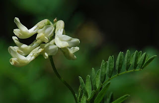


I think I will select the Cooper's milk vetch, ram's-head ladyslipper, dwarf lake iris as these plants are among the rarer species that grow in the Alvars, as well as having very bright and beautiful blooms that are a source of food for the insects of the area.
The images below are in order


Research
Study of Cormorants
I have decided that the cormorant that is going to be illustrated in the Kelp Forests of Alaska is the Red Faced Cormorant after doing my research (all articles I have red appear as links on blog posts)
I have been collecting images as reference as well and studying their anatomy through the resource of anatomical illustrations. Really interesting stuff.

Stunning illustration of cormorant musculature from "The Unfeathered Bird" by Katrina van Grouw

Some images for reference


Diving reference images. Not the same species of cormorant but still a cormorant, helps understand their movements underwater.


Tuesday, 27 February 2018
Preacher Photoshop Development
Below are some examples of my tests on PS. I have sampled the colours off the psychedelic drawings that I thought were best. I made a board on pinterest with all the posters I liked, link *here*
I think the colours on the last (and only finished) image are very strong, and if I can replicate them well in paints then I will have a very strong print design in my hands hopefully. Definitely have to trim the font on the bottom, it brings down the quality of the entire image because it is not executed as well as everything else. Im loving all the colours to be fair.
Monday, 26 February 2018
Research
Tepui Shrublands, Southern Venezuela
"The Guayana Highlands ecoregion in northern South America is host to an archipelago of isolated sandstone plateaus and dramatic summits atop nearly vertical escarpments. More than 50 of the highest tabletop mountains are the remains of the ancient sandstone tableland overlying the even more ancient granitic Guayana Shield. They range from 1,000 to 3,000 m in elevation. And they are called tepuis (singular: tepui), a word from the Pemón Amerindians. Many tepuis are graced with dramatic waterfalls, the tallest of which (in fact, the tallest in the world) is Angel Falls dropping 979 meters."
frog
Oreophrinela Quelchii
Monkeys
howler monkeys(Alouatta seniculus), night monkeys (Aotus trivirgatus), titi monkeys (Callicebus torquatus), black uakari (Cacajao melanocephalus), weeper capuchins (Cebus olivaceus), and white-faced sakis (Pithecia pithecia), (Podoxymys roraimae)
Cats
Jaguars (Panthera onca) and pumas (Puma concolor)
Restricted endemic mammals
Tyler's mouse opossum (Marmosa tyleriana) and white-eared opossum (Didelphis albiventris), long-tailed weasels, pale-throated sloths
Bats
(Diclidurus isabellus, Pteronotus personatus, Phyllostomus latifolius, Anoura geoffroyi, Glossophaga longirostris)
tepui tinamous (Crypturellus ptaritepui), fiery-shouldered parakeet (Pyrrhura egregia), tepui parrotlets (Nannopsittaca panychlora), roraiman nightjars (Caprimulgus whitelyi), tepui swifts (Cypseloides phelpsi), rufous-breasted sabrewings (Campylopterus hyperythrus), buff-breasted sabrewings (C. duidae), peacock coquettes (Lophornis pavoninus), tepui goldenthroats (Polytmus milleri), velvet-browed brilliants (Heliodoxa xanthogonys), white-throated foliage-gleaners (Automolus roraimae), tepui antpittas (Myrmothera simplex), red-banded fruiteaters (Pipreola whitelyi), three manakins (Pipra cornutai, P. pipra, and Chloropipo uniformis)
Flora Include:
Brewcaria, Tepuia, Celiantha, Neblinantha, Pyrrorhiza, Comoliopsis, Mallophyton, Adenanthe, Aracamunia, Marahuacaea, Coccochondra, Rutaneblina, Saccifolium, Achlyphila
Flora Include:
Brewcaria, Tepuia, Celiantha, Neblinantha, Pyrrorhiza, Comoliopsis, Mallophyton, Adenanthe, Aracamunia, Marahuacaea, Coccochondra, Rutaneblina, Saccifolium, Achlyphila
Research
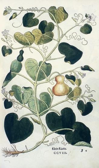
Leonhart Fuchs
Leonhart Fuchs was a medieval physician and botanist. The botanical genus fuchsia is named after him, and consequently the colour fuchsia as well.
He did 500 drawing of animals and plants that were accurate, detailed and printed on woodblocks. Possibly the father of what we would call a scientific drawing for botany.

Subscribe to:
Posts (Atom)